


Client work · 2026
- Client KOKHANA — wedding photo & film, OC & LA
- Role Freelance Brand & UI Systems Designer
- Scope Logo system, color, type, Figma library, animation
- Tools Illustrator, Figma, After Effects
Challenge
KOKHANA, a Ukrainian word meaning “beloved,” is a wedding photo and film studio in Orange County and Los Angeles. After I rebranded KIMFILMS, its owner referred me to KOKHANA, his wife’s studio. It needed an identity of its own: part of the same family business, but clearly not a copy of KIMFILMS, and delivered as files the studio could use on its own website.
Solution
I built the identity as a system rather than a single logo: five marks (a primary lockup with the founding year, a stacked KH lockup, a round seal, a wordmark and a KH monogram), seven colors from ink to off-white, and two typefaces: Awaken for the name and Sunsive for everything around it.
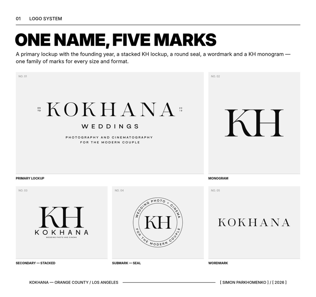
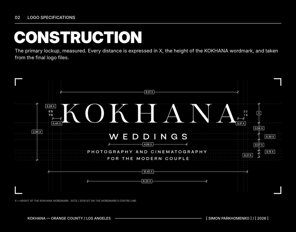
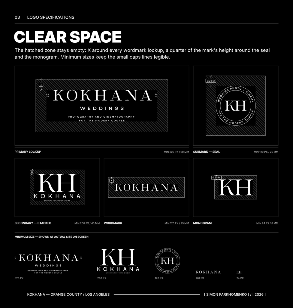
Every mark exists in all seven colors as PNG and SVG files. All 35 versions are outlined and organized in one Figma file, named by mark and color. I also animated the KH monogram in After Effects.
Result
The identity is live on kokhana.com. The studio built its site on Showit with my files: the header is set in Awaken, the KH seal sits in the footer and the KH monogram is the favicon. The monogram animation is used in the owner’s portfolio.


